How to view and monitor the Facility Map
Wiki: Floor concepts
When to use this
You want the plant laid out the way it actually sits on the floor, areas containing cells and stations, nested together, instead of a flat list, with live run-state and flow between machines at a glance, or the same nodes’ OEE-family rollup colored in instead. This is Floor’s landing screen and the one place both those questions get answered.
Steps
- Click Floor in the nav, it opens straight on Facility Map (
/facility), Floor’s landing screen.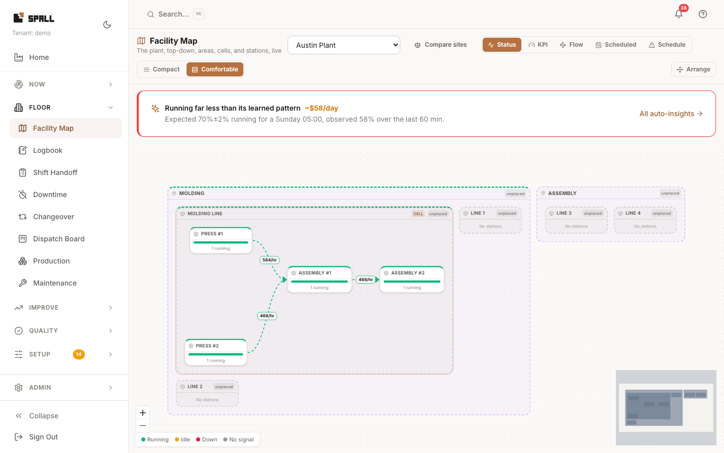
- Pick a site from the dropdown at the top (a facility map is scoped to one site at a time). The canvas
renders every level nested together, areas containing work centers/cells, cells containing stations, colored by whichever lens is selected:
- Status (default): each box shows its running/idle/down mix.
- KPI: pick a metric (OEE, availability, performance, quality, utilization, TEEP), each box shows a value and a tone band, at every level from site down to machine, with a placeholder wherever there’s no rollup yet instead of a made-up number. This is the plant’s OEE roll-up, colored in on the map instead of a card tree.
- Flow: dims everything except designated assembly cells and lines, and shows live rate on the edges between them. A station running noticeably ahead of, or starved by, its neighbor gets a small Accumulating or Outpacing feeders badge. Both compare that station’s own rate to the very next station’s, a ratio between the two, not a reading from a single sensor, see the legend in the bottom-left corner of the map for what each one means.
- Schedule: colors each machine by whether the job it is running right now is behind its own plan, the same math the Dispatch Board’s cards already use. A machine glows red when it is Late (past its scheduled end time), amber when it is At risk (behind the pace it would need to finish on time), and stays quiet when it is On track. A machine with no real job currently running shows dim and neutral, instead of a fake “on track”. Hover a glowing machine, or open the legend in the bottom-left corner, to see the plain-language reason, for example “behind plan by 2h 15m”.
- Use the Scheduled window control to switch between “right now” and a scheduled look-ahead. This is a different question from the Schedule lens above: Scheduled shows what is due to START SOON on each machine, Schedule shows whether what is running RIGHT NOW is behind plan.
- Click an area to drill into it, the canvas re-roots on that area (same nested rendering, smaller scope) with a breadcrumb back to the site.
- Click a designated cell (an assembly cell or line, marked in the plant hierarchy, see
How to manage the plant hierarchy, step 5) to open its
own monitor canvas at
/cells/:cellId, the same surface this page links out to instead of reimplementing. A breadcrumb across the top (Facility Map / the area’s name / the cell’s name) always shows where you are, click Facility Map to go back to the full site plan. - On a cell’s own monitor, click any machine to see why it’s running, idle, or down: its downtime pareto,
OEE, and a deep KPI switchboard, see
How to check plant status and drill into a problem for what’s on
that page. The whole box is clickable, the same as the small Machine detail link inside it, both react
the same way. Hover or press a box to see it light up before you click.
- Use Status, Activity, or Schedule next to the time window to change what colors each box: Status (the default) colors by running/idle/down/no signal, the same mix the site plan itself shows. Activity colors the same boxes by how hard each one is working right now (utilization), so a machine that is technically “running” but barely producing stands out from one running flat out, even though both would read the same green under Status. Schedule colors each station by whether its current job is late or at risk against its own plan, the same lens and legend the site plan’s Schedule option above uses.
- Focus active dims any station with no job currently assigned, so what actually has work running stands out. Checking it shows a Dimming idle stations confirmation right next to it, so it is always clear whether it’s on.
- Click anything else on the site plan, a plain work center or a machine that isn’t part of a cell, to open its own full page directly, the same downtime pareto, OEE, and KPI switchboard step 6 describes.
- If you have admin access, Arrange makes every box on the map draggable and resizable, nested ones included: drag a machine to reposition it inside its cell, drag a cell to reposition it inside its area, and drag an area (or any container) to move it together with everything inside it. A box always stays inside its parent on the map. To move a machine into a different cell or area, change its parent in the plant hierarchy instead (see How to manage the plant hierarchy). Every drop saves automatically, and an indicator next to the Arrange button tells you so: Saving while a save is in flight, Saved once it lands, and a clear Not saved message if one fails (drop the box again to retry). Positions persist across reloads, exactly where you left them. A node with no saved layout auto-grids with an “unplaced” hint until someone arranges it, so the map is useful with zero setup effort from the first login.
- Optionally, an admin can lay a floor-plan image underneath the boxes (Arrange mode) so the map matches the literal shape of the building, instead of a plain grid.
On a phone
On a narrow screen, Facility Map opens to a List view instead of the spatial canvas: the same machines as a flat, priority-ordered list, whatever needs attention (down, then idle, then no-signal, or late, then at risk, on the Schedule lens) sorts to the top, with each row showing its area/cell and, on the Status lens, a running/idle/down badge (KPI, Scheduled, and Schedule show that lens’ own value instead). Tap a row to see why a machine is down, or to open its cell’s live monitor if it’s part of an assembly cell or line, the same destinations you’d reach by clicking a box on the full map.
Tap Map next to List to switch to the same spatial canvas desktop uses, pan and zoom it like any map. The Flow lens always opens the map, since flow is about the live rate between machines, which only makes sense drawn as a diagram. Arrange mode is map-only too. The map is the primary view again on a tablet or larger screen, with List available as its own tap away.
On the Status lens, a line with nothing modeled under it yet doesn’t get its own “No stations” row, or one per empty line. Instead every empty line on the list collapses into one row that states the count, for example “Lines with no stations (4)”. Tap that row to expand it and see each empty line, or tap Add machines to go set them up. Nothing is hidden, just tucked behind one tap, and the list remembers whether you left it expanded.
Notes
- A “facility” here always means a site, the underlying
/facilities/{site}/planendpoint is site-scoped. There’s no separate all-sites map. Running more than one site? A Compare sites link next to the site picker takes you to Performance, which ranks every site, area, line, and machine on the same yardstick, see Floor concepts. - Facility Map’s live flow edges (rate + state between assembly cells) are the same live data that also drives Kiosk wallboard tiles, see How to build a kiosk wallboard.
- If a box shows “unplaced,” that node exists in the plant hierarchy but has never been dragged into position, it still renders (auto-gridded), it’s just not laid out to match the floor yet.
- The Scheduled lens shows jobs due to start soon on each machine, pulled from the Dispatch Board, not what’s running right now. “Nothing scheduled” means none are due to start in the current window.
- The Schedule lens is a different question from Scheduled above: it looks at the job actually running on a machine right now and asks whether it is behind its own plan. A Logged from the floor entry (see How to tell Spall what a machine is running) is never graded late or at risk, since it was not a scheduled commitment in the first place, it shows as no scheduled job instead.
- “No signal” means exactly that: a station with no run signal reaching it is shown as no signal, instead of a fake 0%.