How to find and reduce changeover loss
Wiki: Floor concepts
When to use this
You want to know which asset’s product-to-product changeovers are eating the most capacity, and whether they’re getting better or worse over time.
Steps
- Click Performance, then Changeover (
/changeover), right after Downtime, changeover is planned downtime, so it sits next to its closest sibling.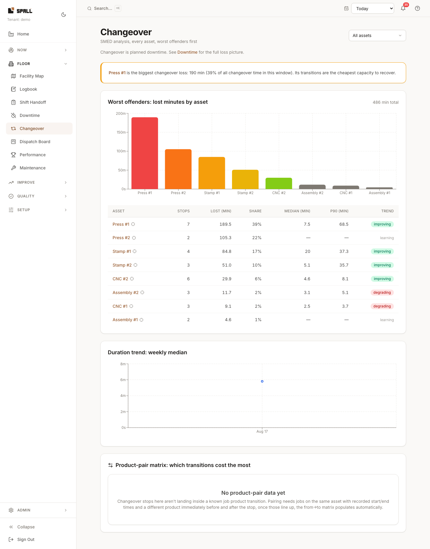
- The worst offenders chart ranks every asset by lost minutes in the window, an auto-generated callout names the single biggest loss and its share of total changeover time.
- The table adds stops, share, median duration, P90 duration, and trend (improving / stable / degrading) per asset, an asset with too few stops to trend reliably shows “learning” instead of a guessed direction.
- The duration trend chart shows weekly median changeover time, so you can see whether a SMED effort is actually working.
- The product-pair matrix shows which specific product-to-product transitions cost the most, but only once changeover stops can be paired to a job product transition (a different product recorded immediately before and after, on the same asset). Until then it says so instead of showing a blank grid.
- An asset’s name in the table is a link to that machine’s own page. To stay on Changeover and instead focus the whole page on just that asset, click the small target icon next to its name, a cost & targets card appears with the weekly $ changeover tax, how many stops ran over target, and the actual median vs. the routing’s standard changeover time.