Every plant running more than one shift eventually has the same conversation. Someone’s convinced nights are worse. Someone else thinks it’s just a feeling, nobody’s actually looked. Both are usually a little right, because the shift comparison most plants reach for first is built to confirm whatever anyone already believed.
The comparison that lies
Pull a scrap rate for days against nights and it’s tempting to read the gap as a people problem. Sometimes it is. Just as often, days is running the easy long batch job that barely needs touching, and nights inherited the changeover heavy short runs because that’s when the schedule happened to land them. Of course nights looks worse. It’s not running the same work.
The same trap catches machine assignment. If days runs three machines and nights runs one because a machine’s down for maintenance overnight, comparing the two shifts’ total output is comparing different fleets, not different crews. A shift comparison only means something when it’s holding two variables still: the same machines, and roughly the same product mix. Change either one and the gap you’re looking at might be entirely explained by what was running, not who was running it.
What accurate shift data actually requires
The precondition for any of this is a shift schedule Spall actually knows about, who’s on when, covering the whole window you’re comparing. Skip that setup and the comparison doesn’t just get less accurate, it can actively mislead, because production that happened outside any defined shift has to go somewhere, and folding it into whichever shift is nearest is how a clean looking gap turns out to be built on guesswork.
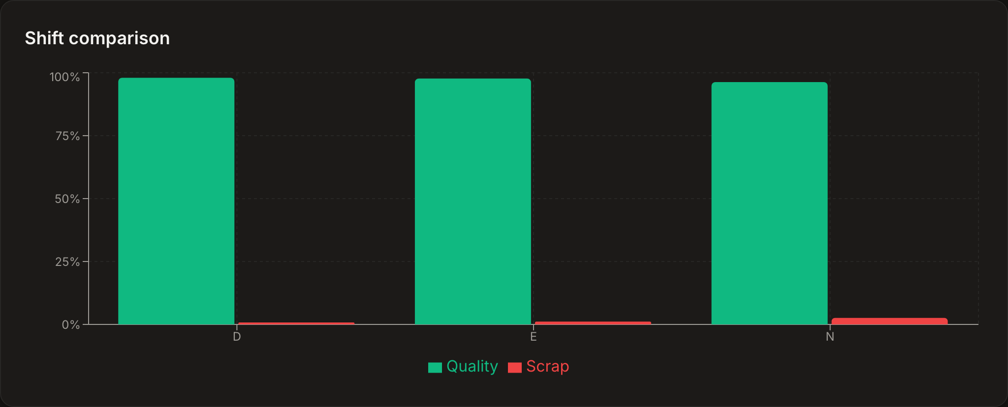
Spall’s shift comparison chart, on the Reports page, holds a specific line here: quality and scrap rate sit side by side for each shift, and a shift with no output for the window leaves the chart instead of showing a fake zero percent. If a meaningful share of the window’s production has no shift schedule covering it, a banner appears above the chart stating the exact percentage and linking straight to shift setup. That banner is the tell worth paying attention to. A comparison run while it’s showing a large unassigned percentage isn’t wrong exactly, it’s incomplete, and treating an incomplete comparison as a verdict on a shift is how the wrong crew gets blamed.
Why unassigned shift data poisons the chart
Unassigned production isn’t a rounding error, it’s a hole in the denominator. If ten percent of a window’s output has no shift attached and that ten percent happened to be an unusually clean run, excluding or misattributing it can drag an otherwise average shift’s number down. If it happened to be an unusually rough stretch, the opposite happens. Either way, the shift getting compared against that hole is being judged against a number that isn’t fully theirs.
The right response isn’t to guess which shift the orphaned time belongs to. It’s to surface the gap and fix the schedule. Once shifts are actually configured for the whole window, the comparison stops needing an asterisk.
What to actually do when nights run worse
Assume the comparison is clean, same machines, same mix, shift schedule covering the window, and nights still comes out behind. The instinct is to tell the night shift to try harder. That’s rarely the useful next step, because “try harder” doesn’t point at anything specific, and a diagnosis that doesn’t point at something specific doesn’t change behavior, it just adds pressure.
Break the gap apart before assigning blame. Is the difference sitting in downtime minutes, in scrap rate, or in cycle time? Each one points somewhere different. If nights loses more downtime minutes, pull nights’ Downtime Pareto specifically and see what’s actually stopping the machines. It’s common to find the top reason is something structural, waiting on a quality hold because there’s no QA coverage overnight, or waiting on a changeover because the second shift set nights up for a job swap nobody briefed them on. That’s not an effort problem. That’s a staffing or process gap that happens to show up as a shift difference, and the fix is a coverage change or a handoff process, not a pep talk.
If the gap is scrap rate instead, that’s a different investigation, worth checking whether the same operators are running nights consistently or rotating through, since unfamiliarity with a specific job is a common, fixable cause that has nothing to do with effort either.
How often to actually look
A single bad shift isn’t a pattern, it’s Tuesday. Machines have off days, materials arrive inconsistent, someone calls in sick and the crew’s short handed for six hours. Reacting to one shift’s number is how you end up chasing noise instead of signal. A weekly view, watched for three or four weeks running in the same direction, is a much sturdier basis for a real conversation than any single shift’s chart.
Checking daily also trains people to distrust the chart. A supervisor who looks every morning and sees the gap bounce around with no clear direction stops believing the tool means anything, because on any given day it doesn’t, not by itself. The chart earns trust on a weekly cadence, when the same shift keeps showing the same gap for the same reason, not on a daily one, when it’s mostly showing you which machine happened to jam on Tuesday.
Bring the finding to the shift, not a verdict about it
Once a real, isolated gap shows up, the way it gets discussed matters as much as the finding itself. “Nights runs at 78% and days runs at 91%” delivered as a scoreboard reads as an accusation, and a crew that feels accused gets defensive instead of curious, which is the opposite of what you want from the conversation. The same finding delivered as “the Pareto says nights loses forty extra minutes a week waiting on a quality hold, what’s actually happening there” reads as a question with an answer somebody on that shift already knows. They’re usually right, and they’re usually the fastest way to the actual fix, because they’re the ones standing there when the hold happens.
A shift comparison built on matched machines and mix is a diagnostic tool, not a leaderboard. Treat the gap as the start of a conversation with the people who can explain it, and it tends to close. Treat it as a grade, and it tends to just make people quieter about what’s actually going wrong.
Quick recap
- A shift comparison only means something with the same machines and roughly the same mix on both sides
- A shift schedule has to cover the whole comparison window, unassigned production corrupts the chart
- A shift with no output leaves the chart instead of showing a made-up rate
- An unassigned-production banner is a signal to fix shift setup, not to trust the comparison anyway
- Break a real gap apart by downtime, scrap, or cycle time before deciding what to fix
- Judge shift performance on three or four weeks, not one, a single bad shift is usually noise